March 3, 2022 – May 15, 2022
2022 marks the 50th Anniversary of the Wharton Esherick Museum. To celebrate WEM’s founding, as well as the experiences of the thousands of visitors over the years who, through their time in the Studio, have found themselves while also discovering Esherick’s legacy, vision, and continued relevance, this installation is the first in a series of exhibitions and programs that will explore the idea of “home” in order to celebrate WEM’s 50 year history and to think creatively about the next fifty years – and beyond.
This installation will be on view in our Visitor Center, which is open during our current tour hours. Please note, all visitors to our site must show proof that they are fully vaccinated and guests wishing to enter the Studio must make advance reservations for a tour. Our Home As… series will continue with Home as Self, WEM’s 28th Annual Juried Woodworking Exhibition, opening in June, and Home as Stage, opening this fall.
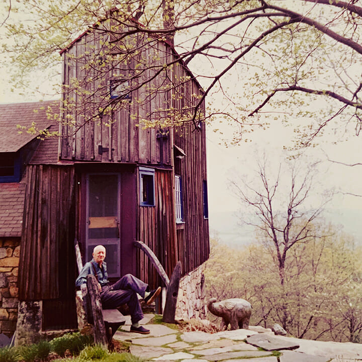
WEM’s campus was home to Esherick in more ways than one. It was the literal home where Esherick’s life unfolded through a myriad of changes in his family and identity. It was also Esherick’s artistic home, a home to his truest expression of self and the site where he created the vast majority of his work. Esherick considered his Studio an autobiography in three dimensions.
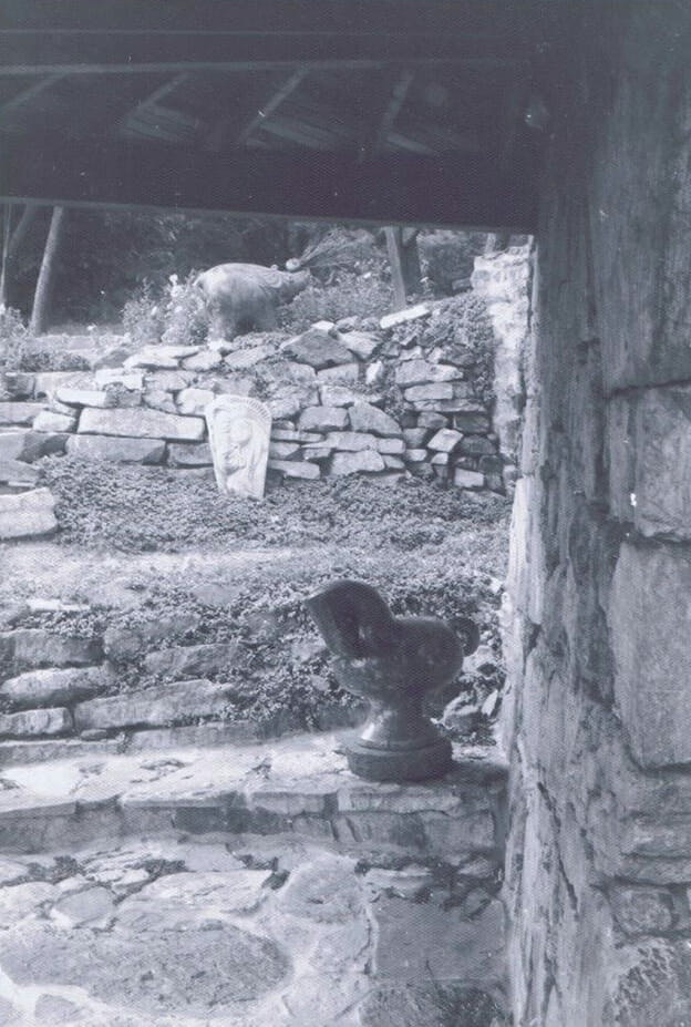
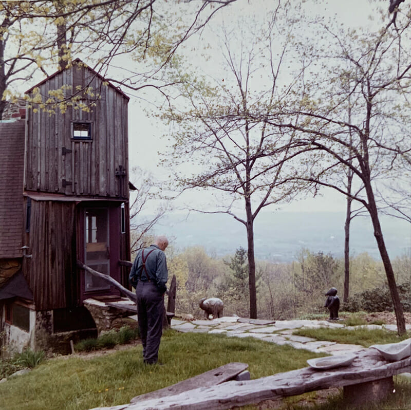
Home as Site explores the physical nature and architecture of the WEM campus, including what gives the site its power and how it came to be. While we might think of the Studio and WEM campus as static because it has changed very little over the past 50 years, during Esherick’s lifetime the site was dynamic and responsive. How did Esherick’s original ideas, and subsequent changes to the architecture and organization of this singular place, allow for a series of creations and re-creations of home? Who were critical collaborators, partners, and sounding boards for the site’s architecture as it changed between 1913 – when the Eshericks settled at the Sunekrest farmhouse – and Esherick’s passing in 1970? How has the site gained new purpose and possibility since opening to the public?
In this installation, images, blueprints, and other materials illuminate how the Studio site has shifted and changed over time and in response to Esherick’s evolution as an artist and person. The next phase of the site’s architectural evolution is also a part of the story. Shared here are materials related to the museum’s Campus Masterplan project, which envisions the first new additions to the site in five decades.
Studio & Addition (1926-1940)
To start with, we must have a piece of land. Through a wood, on an old worn path, a path buried in briar and brush – but it still stands as evidence of patting feet… I went through the path to a clearing, saw several trees which I imagined should be sheltering a roof. There it started, roots blasted, rocks thrown aside, hole dug for foundation and with mason and mortar and black labor to mix the mortar, I started.
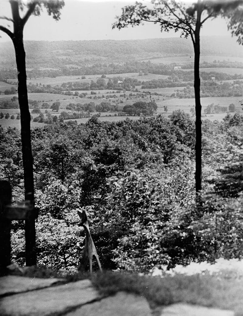
While very little in Esherick’s own words exists about the initial construction of his studio, this passage from “I Build a Building – or – He Helps Me Build a Building,” an unpublished essay about building the site done at the encouragement of Esherick’s close friend, the writer Theodore Drieser, gives a sense of the Studio’s earliest beginnings as an idea soon to be made real. Esherick details the path as he walked it with “Old Jack,” a man who once worked as a waterboy to the local quarrymen. The path led through the woods, and Esherick would follow it from Sunekrest (his family home purchased in 1913) towards the studio site in order to view the open expanse of the valley below. Prior to building the Studio, Esherick used $350 given to him by family to purchase the 7 acre parcel so that a quarry would not be reopened on the site.
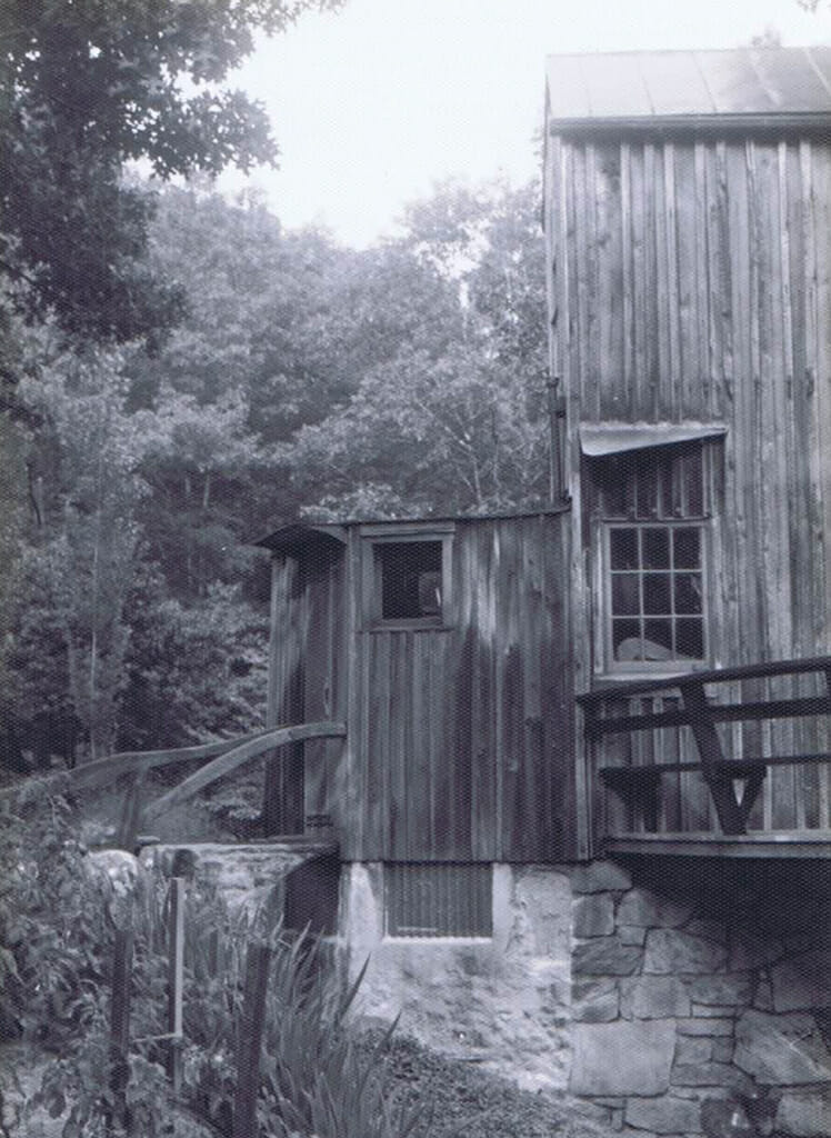
As Esherick moved from painting to creating works in wood as his primary artistic practice in the early to mid 1920s, it became clear that he would need additional space beyond his small barn studio adjacent to Sunekrest in order to satisfy his ambitions. Despite not having any formal training as an architect, Esherick set about designing a space that drew from three primary influences: the writings of architect Frank Lloyd Wright (1867-1959) and his concept of organic architecture that grew seamlessly from a landscape; the architect and philosopher Rudolf Steiner (1861-1925), whose esoteric spiritual movement anthroposophy included an architectural framework that prioritized curvature and forms from nature; and the vernacular architecture that already populated the hillside, especially local banked barns with massive stone walls.
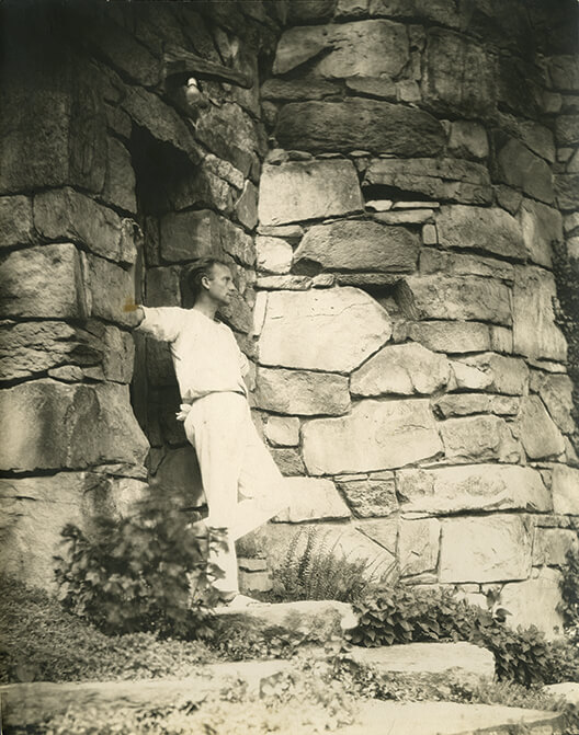
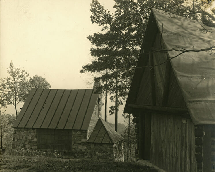
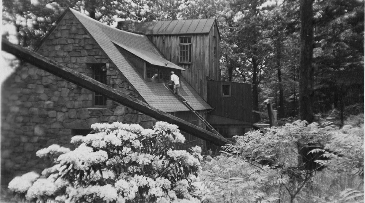
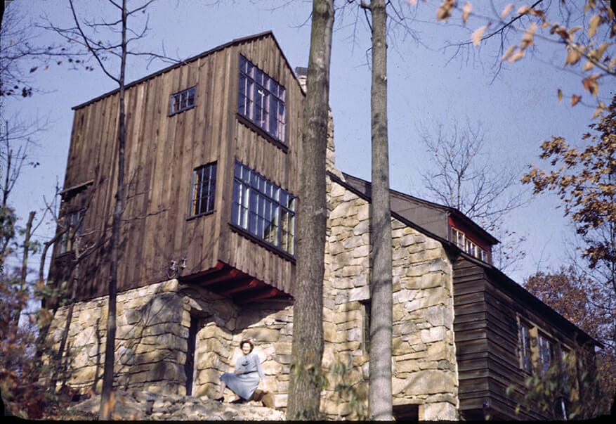
The Studio (1926) melds all of these ideas in a building which seems to grow directly from the site itself. It evokes a barn, but one with stylized, tapered walls that curve out at the base like a tree trunk. Where a farmer might have had a large door for a hay wagon, Esherick placed a large north-facing window with ribbed glass to diffuse the light that entered the primary space, which had a partially earthen floor. Vernacular architecture was literally incorporated into the site. Hand-hewn timbers from a soon-to-be demolished water wheel owned by the family of Aaron Coleman – a farmer who worked on the Studio’s construction – dictated the scale of the space. Cast-off sandstone used for local limestone kilns was instrumental in the construction, overseen by stonemason Albert Kulp. Coleman and Kulp are two of the figures now immortalized in the sculptural coat pegs Esherick produced for the Studio’s interior. Esherick writes of both the site and the building process in romantic and evocative terms: “The first day of laying stone was done as the mason wished to do it, slick square blocks one on the other; a good piece of wall, but not as I thought should be in a wild wood, high in the hill near the clouds.”
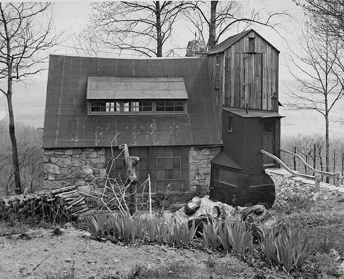
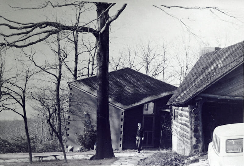
While Esherick constructed a garage just north of the Studio in 1927-1928, the first major shift to the Studio itself came in the late 1930s when Esherick began planning to enlarge the building in order to create living space there for himself and his son Peter, an effort made possible by the income from his commission to create a room for the 1939-1940 World’s Fair. Esherick was also able to purchase 12 additional acres of land to protect his trees and views. The prismatic structure, which was finished in 1940, displays links to Esherick’s interest in German Expressionism. After spending time in Germany beginning in the early 1930s, Esherick’s stylistic approach shifted towards one which centered internal feelings and ideas over realism and was formally expressed through his unique approach to geometry and asymmetry. By 1947, the new addition included a dining room and small kitchen; a tower bedroom for Peter made using wide oak boards from a local tree accessible via a pine spiral staircase; and a bathroom. The new walls built to contain these added spaces also tapered at their base, but prismatically rather than into a curve.
In a later letter, again to his friend Theodore Drieser, Esherick sketches the changes from the Studio’s first iteration to that of its second, writing: “Peter’s room is a tower higher than my bed room. You would like it.”
Unless otherwise noted, all images are from the Wharton Esherick Museum Collection.
Workshop (1956)
Architecture is what nature cannot make.
Architecture is something unnatural but not something made up.
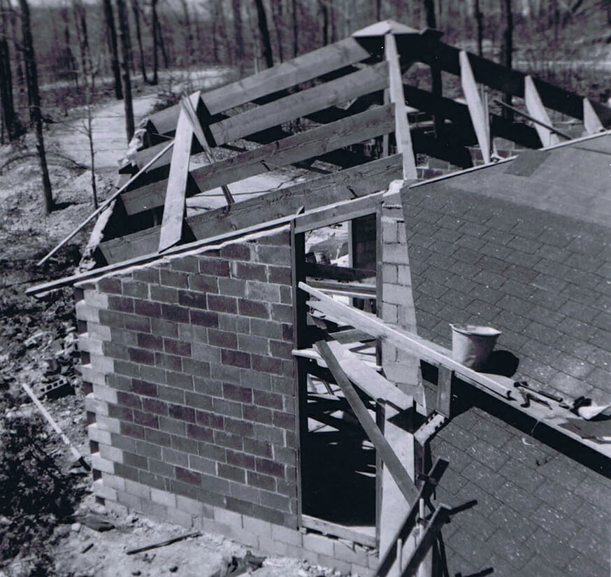
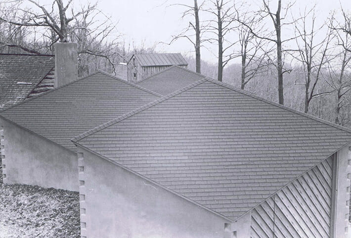
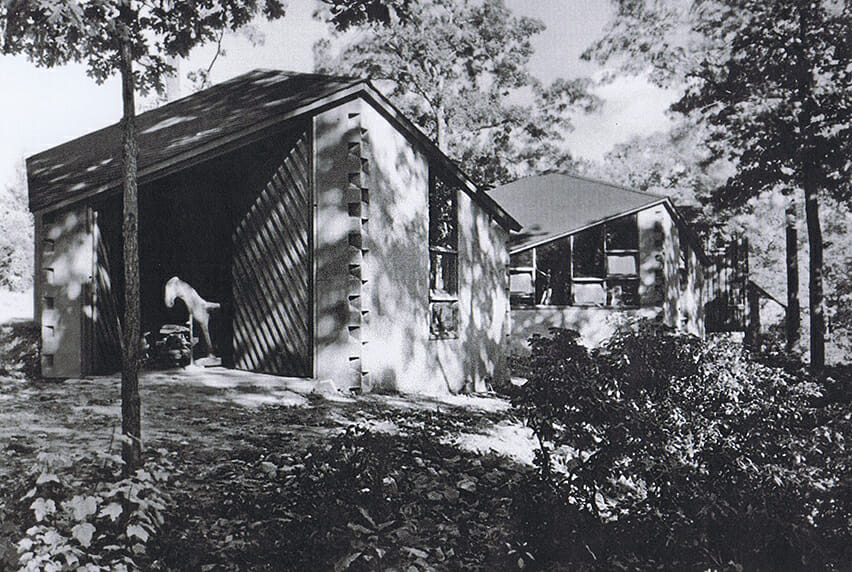
Esherick’s Workshop was built to accommodate the need for additional space in order to keep up with customer demand for his furniture. While the nearby Studio and Garage had been constructed without formal plans despite Esherick not being a trained architect, by the 1950s the requirement of a building permit necessitated that he find a licensed collaborator. Esherick’s friend George Howe, the Philadelphia architect with whom he had collaborated on“A Pennsylvania Hill House”at the 1939-1940 New York World’s Fair, recommended Louis I. Kahn (1901-1974), who Esherick had first met in 1952 when he was a design critic and professor of architecture at Yale University.
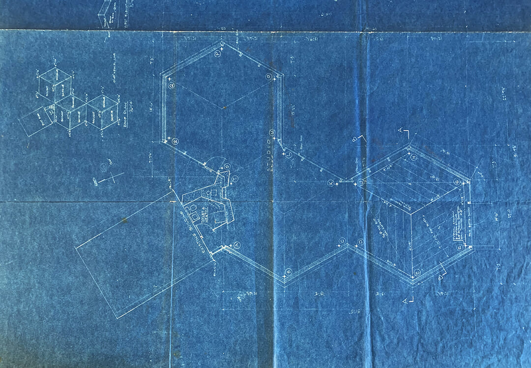
The first meetings to discuss the Workshop design took place in 1954 and included Esherick, Kahn, and Kahn’s regular collaborator Anne Tyng. Esherick had built a small cardboard model of the property and Tyng, who eventually drew the plans for the Workshop, created a selection of model roofs to serve as inspiration. Kahn and Tyng were known for rigid geometry and together with Esherick, chose a structure consisting of three hexagonal bays, each assigned a specific funtion. Tyng noted that these were honeycombed shaped in keeping with the space’s nature as a place for work, and in an oral history with WEM, shared that “Wharton didn’t mind the geometry because it created a certain tension… geometry, in a sense, was a kind of underlying order—an archetypical order behind everything that would give architecture power…. And I think that rather appealed to [Esherick] because that’s really his approach. I mean with a board he saw how the grain ran and used those things on which to build the work he did and that kind of geometry was really more on a microscopic level—the atoms bond and how all those things work.”
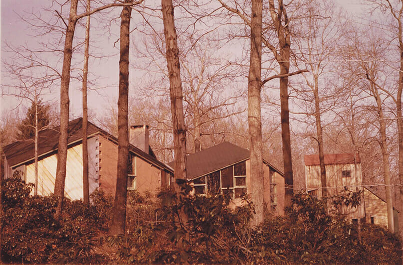
While Kahn and Tyng dominated the formal nature and ideology behind the building, Esherick’s insertions and alterations made sure that his mark was on the finished product. He asked the masons not to fill the spaces where the cinder block walls came together, because the corners they formed looked similar to dovetails. Kahn and Tyng’s drawings show straight walls; however Esherick, who oversaw the construction, would kick in cinder blocks at night to create a gentle curvature where the foundation is exposed. The exterior surface of the Workshop was intended to be gray, and evolved to red, and then to its current blue, perhaps serving as inspiration for the pigmented stucco on the Studio silo. The placement of the large windows – a Kahn signature – was done to Esherick’s specifications so that they faced south and overlooked the valley. Likewise, the fireplace in the central bay is not the sleek and rectangular model Kahn first proposed, but instead an inlaid, cone-shaped slope with an arched opening similar to the fireplace made for the book room at the Bok House, with a twisted chimney. Although both Esherick and Kahn’s initials appear on the cornerstone, both men allowed the other to claim credit for the design.
The next morning I wandered into the kitchen where Wharton was cooking breakfast. We probably grunted or groaned some greeting and set to breakfast in dull silence. Finally Wharton broke it and said,“You know Lou would be a helluva good architect if he didn’t talk so damn much.”
Unless otherwise noted, all images are from the Wharton Esherick Museum Collection.
Silo (1966)
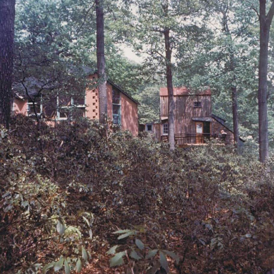
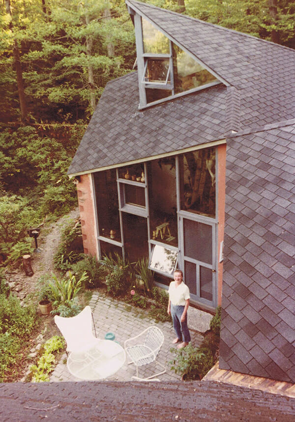
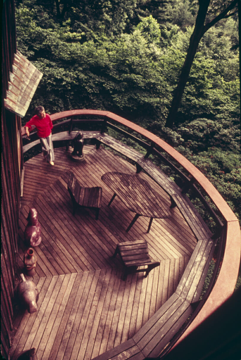
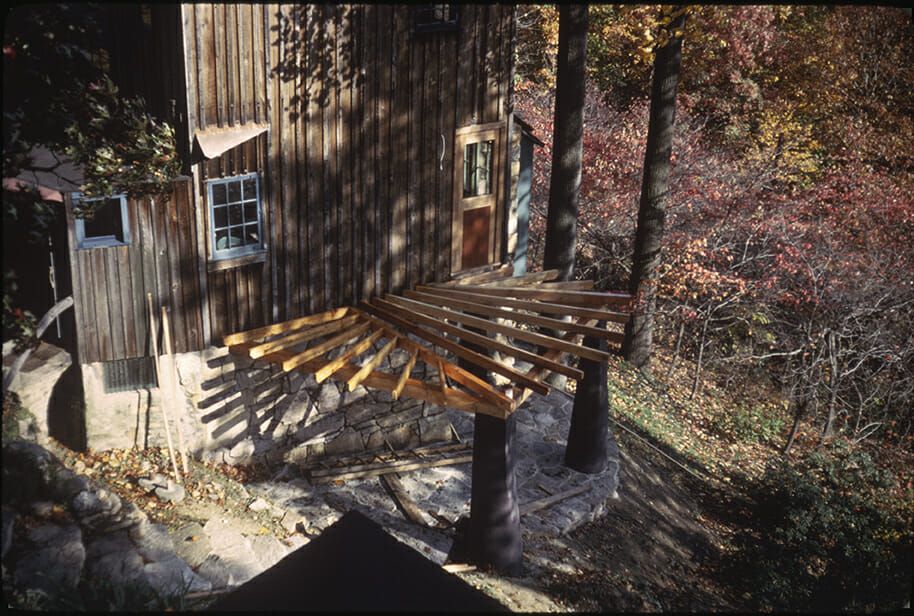
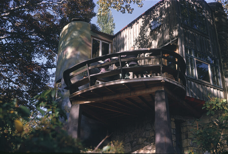
The Silo is the final addition to the Studio and houses a small but efficient kitchen space, as well as a second story above. It is also a return to the influences that marked Esherick’s initial planning for this building. Esherick returned to his interest in Pennsylvania’s rural, vernacular architecture; this is true not just in the silo form itself, but in elements like the masonry piers of stuccoed stone and mortar under the deck which overlooks the valley below. These were inspired by the tapered round columns used to support overshoots on large barns; their forms worn away by cattle using them as scratching posts.
The silo is largely emblematic of the softer, more curvilinear approach that characterized the latter part of Esherick’s career. It also provided a visual anchor to balance the high, narrow wooden wing formed by the deck and is inherently informed by the site, dappled with color that reflects the surrounding landscape at autumn’s peak. Made of concrete block and brick, the silo was surfaced with stucco into which color was mixed. This fresco had to be completed in one day and was a nod to his beginnings as a painter. At age 79, Esherick did the lower part on his own but had to depend on two masons for the upper components.
By the 1960s when the silo was added on to the Studio, Esherick needed to work with licensed architects on any plans for expansion. This architectural drawing not only features plans for that expansion, but also hand-drawn and written annotations in red from Joseph Esherick (1914-1998), a renowned architect who co-founded and taught at the University of California Berkeley’s College of Environmental Design for almost forty years – as well as Wharton’s nephew. Joseph grew up in Philadelphia and began learning from Wharton at an early age, even working for him on objects for the Bok House after graduating with his BA in architecture from the University of Pennsylvania in 1937. It is difficult to imagine that Joseph Esherick’s career creating buildings that were designed to integrate with and be responsive to their surroundings, and which took vernacular architecture seriously, wasn’t impacted by his time at this site. It is difficult not to think of the silo when hearing Joseph Esherick’s philosophy that “The ideal kind of building is one you don’t see,” or of Wharton Esherick in general in the idea that “No successful architecture can be formulated on a generalized system of aesthetics; it must be based on a way of life.”
Unless otherwise noted, all images are from the Wharton Esherick Museum Collection.
Campus Expansion
In 2017, the Wharton Esherick Museum team began the process of thinking about how this extraordinary site – and what we’re able to offer through making the buildings on our campus increasingly connected and accessible to the public – could best serve the needs of new and future audiences. The Philadelphia-based firm Atkin Olshin Schade Architects – whose work includes the Mainwaring Wing at the University of Pennsylvania Museum of Archaeology and Anthropology and the Anne d’Harnoncourt Sculpture Garden at the Philadelphia Museum of Art – began an in-depth study of Esherick’s art and architecture, as well as the site’s history. They also explored the physical nature of the campus as it currently exists, spending time in the landscape, traversing Esherick’s storied pathways through the woods, and learning about the natural materials that comprise the surrounding ecosystem.
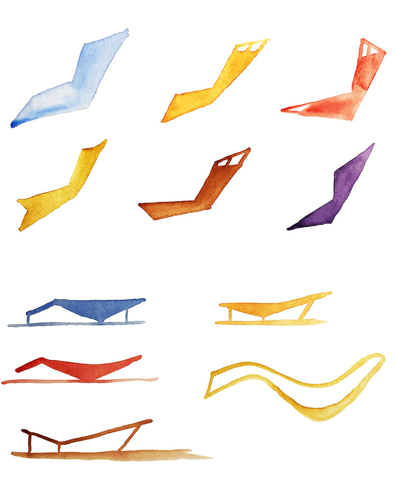
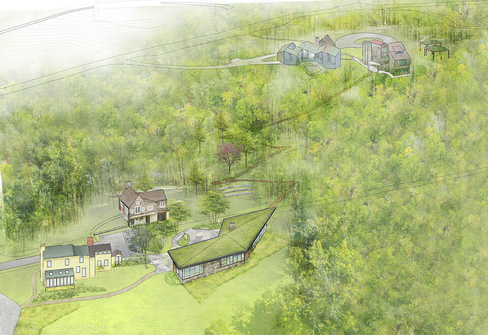
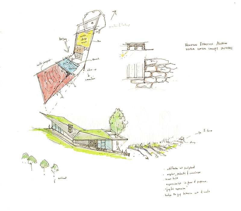
The drawings shown here are evidence of just how deeply the team at AOS integrated their study and research into its plans for the future of WEM’s campus. While the hilltop and Studio remain as Esherick intended, AOS developed design concepts for a new Visitor’s Center at the bottom of the hill (near Sunekrest). It is intended to sit lightly in the landscape, but also become a part of it in an echo of Esherick’s own interest in organic architecture. While Esherick looked to find available materials in his own community that could be repurposed in order to build the Studio, the proposed Visitor’s Center goes one step further, incorporating a green roof on a modest one-story building made from local and sustainable building materials. The shape of the building is inspired by Esherick’s own unique formal language, and one can see visual nods to the angular asymmetry of the Studio’s benches and stair treads in these images.
Architect Sam Olshin’s annotations on his Visitor Center Concept Sketch reflect the legacy of the site and Esherick’s artistic legacy. In a summation of Esherick’s own values, the building is designed to express and emphasize the following ideas:
utilitarian as sculptural
angular, prismatic, and curvilinear
hand-built
expressionist in form and purpose
joyful expression
bridge the gap between art and craft
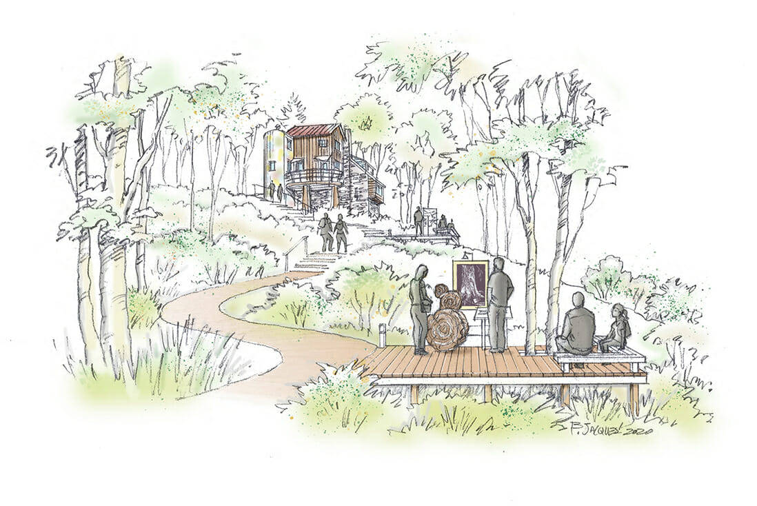
Likewise, a newly built ramble trail mirrors the well-traveled path that first sparked Esherick’s desire to build on the top of the hill. It will allow visitors to follow in Esherick’s daily footsteps while immersing themselves in the site’s native vegetation, including many species of trees that Esherick used in his work.
With these exciting new ways of thinking about the power and possibility of WEM’s campus, it’s evident how truly aligned shifts in and changes to the architecture of this site can carry forward and grow Esherick’s legacy over the next 50 years and beyond.
Images courtesy of Atkin Olshin Schade (AOS) Architects and the Wharton Esherick Museum.
In Esherick’s Library
There are only 12 books on architecture and building in a library of hundreds of volumes in the Studio. Even in this small selection we can learn quite a bit about what Esherick, as an architect without formal training, prioritized in his thinking about the development and shaping of this campus. Several texts reflect the greats of Modernism, including monographs on or by Alvar Aalto, Frank Lloyd Wright, and Le Corbusier. Others profile a type of artist-architect auteurs with which we can see Esherick aligned in sensibility, including two books on Catalan architect Antonio Gaudi and the philosopher-architect Rudolph Steiner. There are also books focused on vernacular architecture, including a volume titled American Barns and Covered Bridges and the catalog for the 1964 exhibition Architecture without Architects: An Introduction to Non-Pedigreed Architecture at the Museum of Modern Art.
In Architecture without Architects, Curator Bernard Rudolfsky writes: “There is much to learn from architecture before it became an expert’s art. The untutored builders in space and time – the protagonists of this show – demonstrate an admirable talent for fitting their buildings into the natural surroundings. Instead of trying to “conquer” nature, as we do, they welcome the vagaries of climate and the challenge of topography.” Rudolfsky’s words seem to mirror Esherick’s overall architectural sensibility, belief in collaborating with geography rather than trying to tame it, and work to design buildings on this site that reflect the local environment and seasonal shifts.

